Dounias is a Greek-Palestinian non-profit
organisation founded by Carol to bring new
colours, voices and perspectives to her
community, while creating a growing space
for dialogue with audiences across Europe.
The project began with the meaning behind
the name. Dunya, from the Arabic Ad-Dunuww,
refers to the world we inhabit — the world
that is closest to us. This idea of closeness
became the conceptual foundation of the
identity: Dounias as a space that holds us,
without restricting us.
- project.name
- Dounias
- project.field
- branding / website
- project.year
- 2026
- project.manager
- Esto Association
- project.website
- douniasgreece
Our goal was to express the organisation’s
values through its logo and visual identity
without falling into cultural clichés.
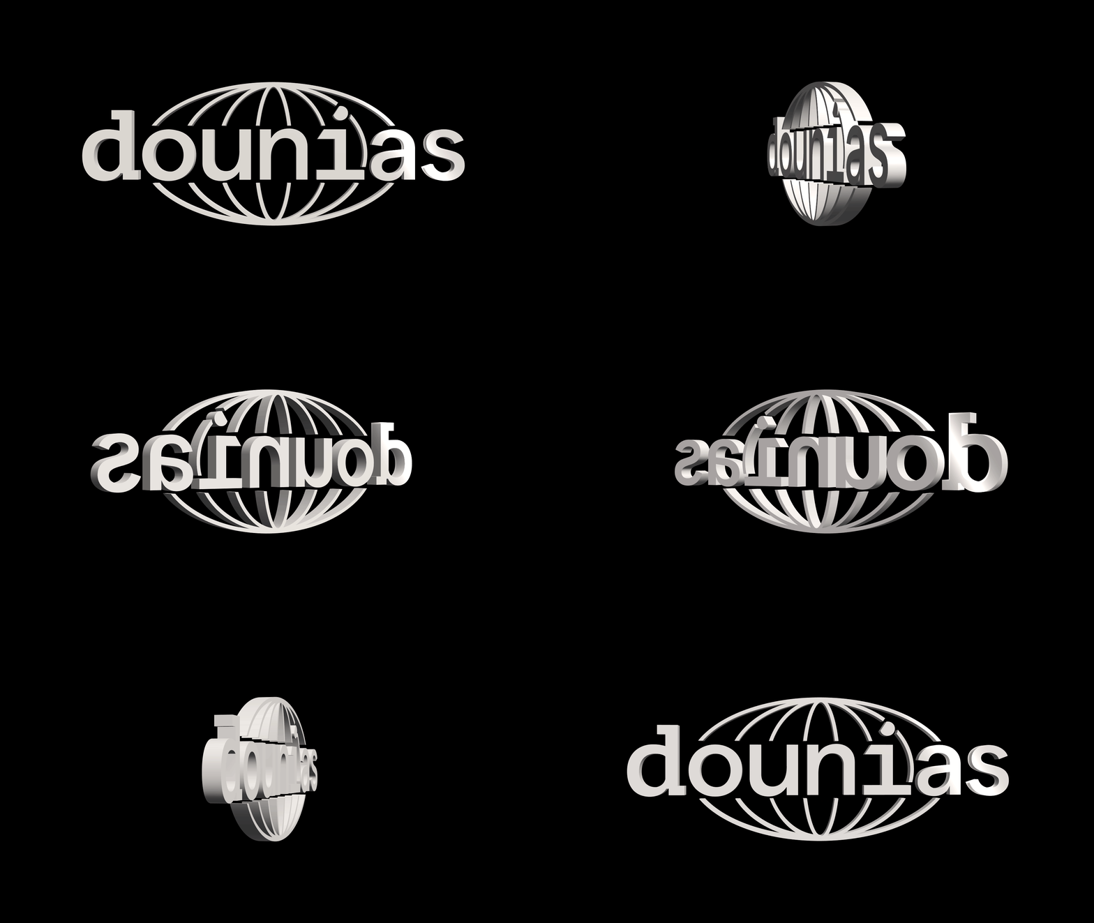
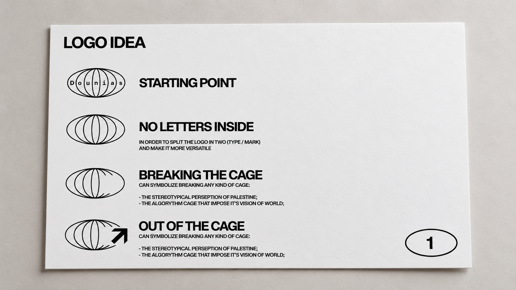
We started by freeing the letters from the
globe-shaped structure of the original logo.
Its enclosing form evoked a cage, conflicting
with the organisation’s values of freedom,
plurality and dialogue. Releasing the letters
allowed the identity to become more open
and flexible.
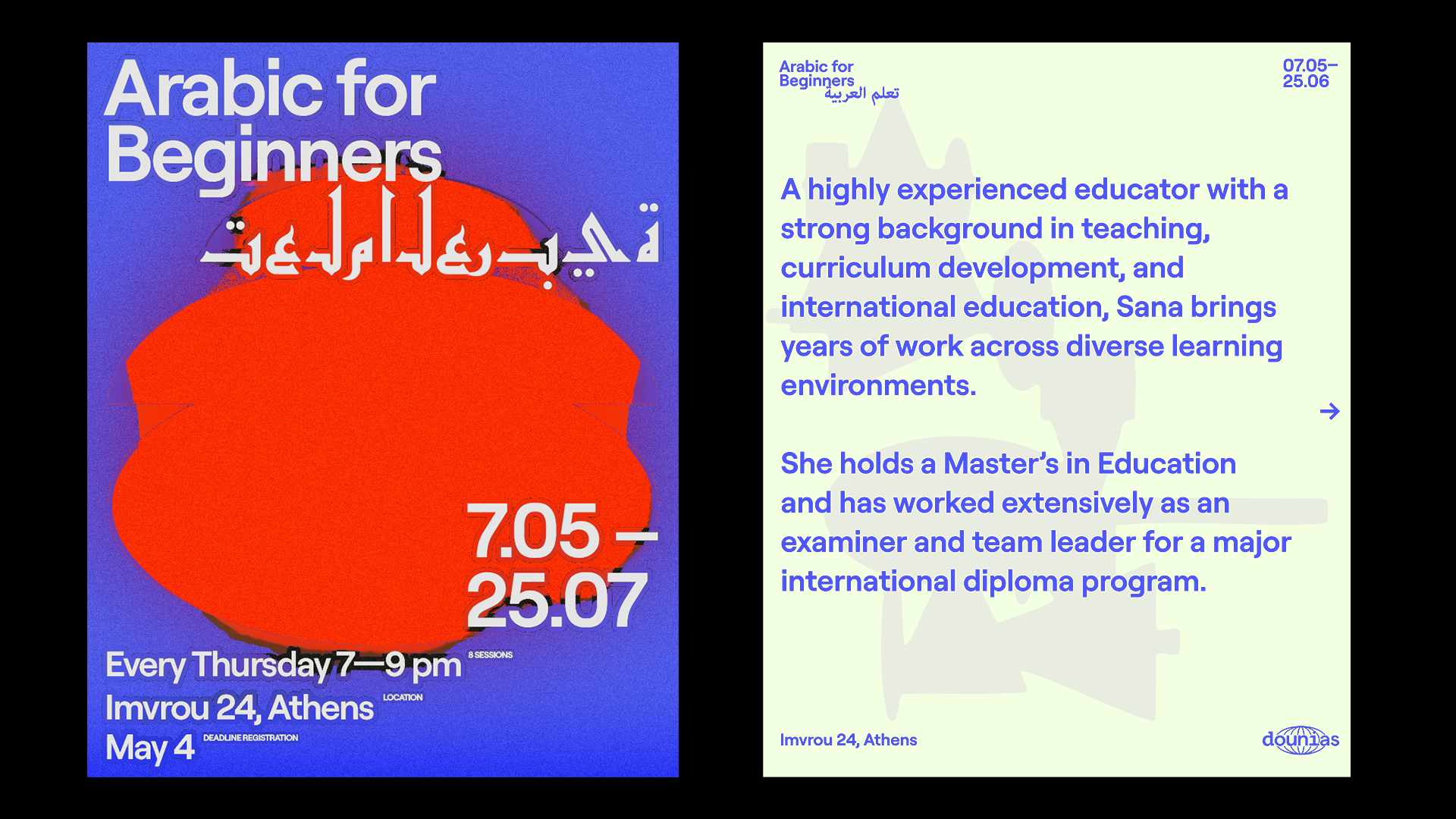
From there, we developed a visual language
built on minimal layouts, oversized typography
and full-bleed imagery to create a sense
of visual immediacy.
The identity avoids stereotypical cultural
symbols in favour of solid forms, direct
compositions and a raw, almost brutalist
aesthetic.